ShopDreamUp AI ArtDreamUp
Deviation Actions


Suggested Deviants


Suggested Collections


![[MMD] Future Computer DOWNLOAD Acc for MMD](https://images-wixmp-ed30a86b8c4ca887773594c2.wixmp.com/f/81188f46-d4db-4baa-892f-dc5e283cac16/da1zhf2-a020fb08-725f-485a-8991-4c3779116c70.jpg/v1/crop/w_184,h_184,x_36,y_0,scl_0.17037037037037,q_70,strp/_mmd__future_computer_download_acc_for_mmd_by_sakuramiz_da1zhf2-92s-2x.jpg?token=eyJ0eXAiOiJKV1QiLCJhbGciOiJIUzI1NiJ9.eyJzdWIiOiJ1cm46YXBwOjdlMGQxODg5ODIyNjQzNzNhNWYwZDQxNWVhMGQyNmUwIiwiaXNzIjoidXJuOmFwcDo3ZTBkMTg4OTgyMjY0MzczYTVmMGQ0MTVlYTBkMjZlMCIsIm9iaiI6W1t7ImhlaWdodCI6Ijw9NTc2IiwicGF0aCI6IlwvZlwvODExODhmNDYtZDRkYi00YmFhLTg5MmYtZGM1ZTI4M2NhYzE2XC9kYTF6aGYyLWEwMjBmYjA4LTcyNWYtNDg1YS04OTkxLTRjMzc3OTExNmM3MC5qcGciLCJ3aWR0aCI6Ijw9MTAyNCJ9XV0sImF1ZCI6WyJ1cm46c2VydmljZTppbWFnZS5vcGVyYXRpb25zIl19.cbpUVlNxF7T03z7V4bLMOFNjQ3CeqJYrhifWNyrUzWE)
![[MMD] Future Computer DOWNLOAD Acc for MMD](https://images-wixmp-ed30a86b8c4ca887773594c2.wixmp.com/f/81188f46-d4db-4baa-892f-dc5e283cac16/da1zhf2-a020fb08-725f-485a-8991-4c3779116c70.jpg/v1/crop/w_92,h_92,x_18,y_0,scl_0.085185185185185,q_70,strp/_mmd__future_computer_download_acc_for_mmd_by_sakuramiz_da1zhf2-92s.jpg?token=eyJ0eXAiOiJKV1QiLCJhbGciOiJIUzI1NiJ9.eyJzdWIiOiJ1cm46YXBwOjdlMGQxODg5ODIyNjQzNzNhNWYwZDQxNWVhMGQyNmUwIiwiaXNzIjoidXJuOmFwcDo3ZTBkMTg4OTgyMjY0MzczYTVmMGQ0MTVlYTBkMjZlMCIsIm9iaiI6W1t7ImhlaWdodCI6Ijw9NTc2IiwicGF0aCI6IlwvZlwvODExODhmNDYtZDRkYi00YmFhLTg5MmYtZGM1ZTI4M2NhYzE2XC9kYTF6aGYyLWEwMjBmYjA4LTcyNWYtNDg1YS04OTkxLTRjMzc3OTExNmM3MC5qcGciLCJ3aWR0aCI6Ijw9MTAyNCJ9XV0sImF1ZCI6WyJ1cm46c2VydmljZTppbWFnZS5vcGVyYXRpb25zIl19.cbpUVlNxF7T03z7V4bLMOFNjQ3CeqJYrhifWNyrUzWE)


You Might Like…


Description
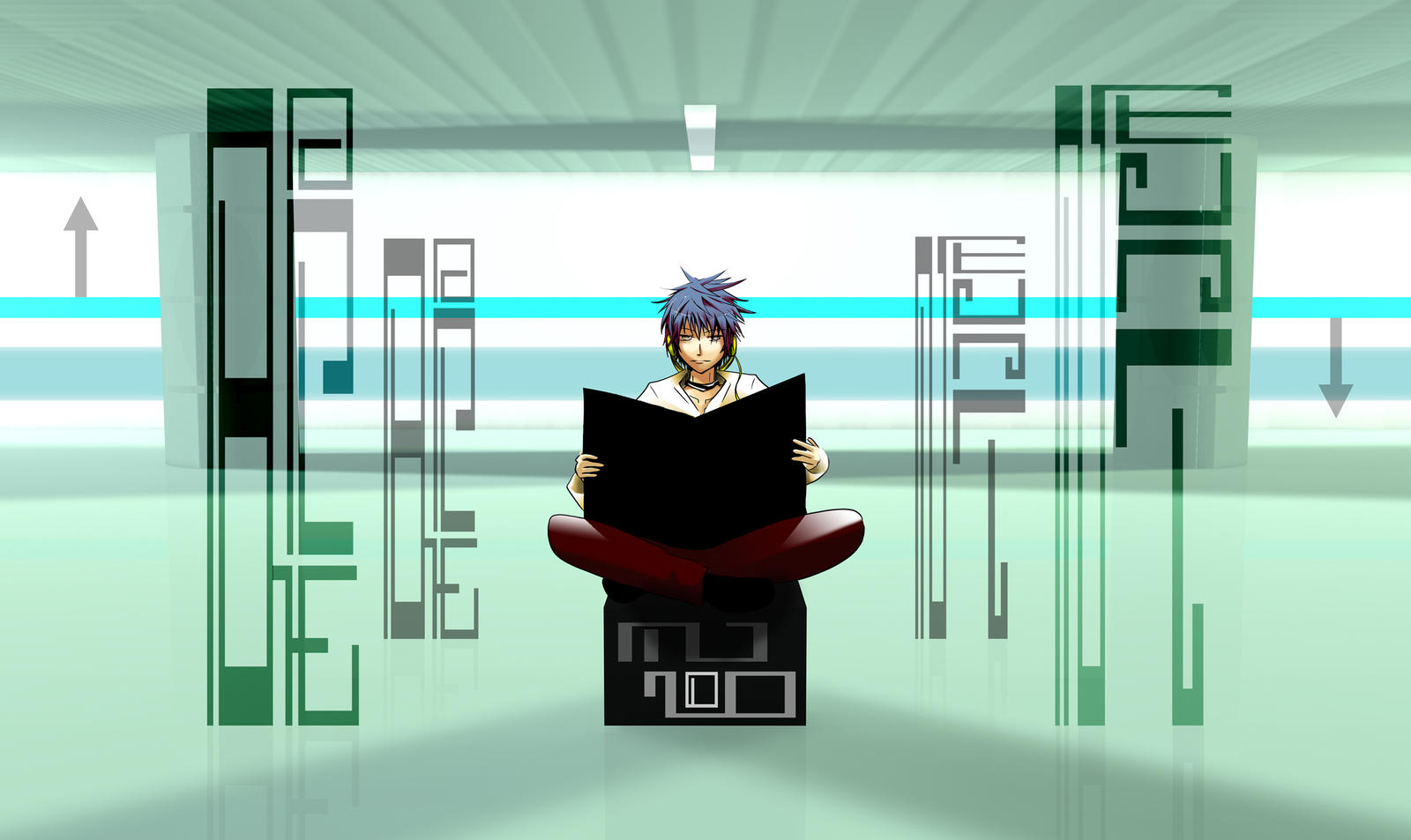
* I recommend seeing this in a full view/download since I encountered a problem last time. I drew too big images which resulted in people not being able to see the details of the character. So, it looked simpler than what it really was, especially for h20 version 1.
This incorporates the following:
-Vector (for real... since I think I mistakenly said vector for some of my previous illust. without using Illustrator but Photoshop. However, the word Next on the right is the only one that's vector)
- 3D CG
- manga/anime character
- typography
I wanted to draw this since a couple of months ago but didn't have enough 3D CG skill back then- so I left it off. It might not be enough even now- but I hope to get better soon with more practice.
I think this piece had heavy influence from external sources. Music, fonts, and photographs.
Long explanation:
Typography:
I had a big stress for typography for this piece- which didn't go as well as I planned due to the structure of 3D CG and my inexperience with Illustrator- but liked the result in the end. I used Font K by Mr. Kabutoya from his book, High Grade Design Font. I regained my motivation for creating this illustration after I saw his fonts, in a book I got in Japanese bookstore, and just loved it at the first site. A couple of days later, I contacted the publisher and the artist himself for permission to use in my illustration which I immediately got. I really appreciate their kind help and for Mr. Kabutoya for providing wonderful fonts. (Smile)")
Words read (from left),
Back
Now
Next
Well, they required less alphabets than other similar words so I used them. I could have exchanged "Now" with "Here," but I thought that was stronger word.
I put reflections but didn't put shadows for the typography since I wanted them to stand out a bit more... slightly out of place on purpose.
Character:
I did a bit more shadow for the face and slightly more highlight to blend it naturally to the 3D CG without blurring since I want my pieces to look almost like a photograph/photomanipulation. While I used more brown colors in city, I tried to use totally different color combination. I wanted slightly mysterious look for the expression, similar to iN yOuR dReAmS... similar to expressions of models on fashion magazines. The newspaper and highlight on a character turned out a little uneven but this piece- I didn't focus too much on a design like last time so I left them as it was.
He's holding on a newspaper- which I turned on black on purpose since I first wanted typography there as well. However, it got too crowded so didn't.
3D CG
I tried to have a look of an imaginary subway station. I first planned to have some signs up but didn't since it would destroy typography. Everything but the character, arrows, and typography is 3D CG. I had hard time trying to choose which lightening to use. I think I used more than 10 lights.
Special thanks to:
 Mr. Kabutoya, and his publisher(MdN Corporation, Inc.) for a permission to use his fonts for the illustration
Inspirations
Music: Blue Train by Asian Kungfu Generation (Once mentioned to me by IM-SteelAngel so thanks )
Photography:One Sozai Jiten(commercial stock photo)'s image of Tokyo subway station
Softwares Used:
Comic Studio Ex 4.0
Photoshop CS2
Illustrator CS2
Cinema 4D R11 studio
Time it took:
~ a week but actual work took ~ 3-4 nights
*5040X3000 pixel (png) available in Print
*11/26/09
Featured in:
[link]
Thank you.
This incorporates the following:
-Vector (for real... since I think I mistakenly said vector for some of my previous illust. without using Illustrator but Photoshop. However, the word Next on the right is the only one that's vector)
- 3D CG
- manga/anime character
- typography
I wanted to draw this since a couple of months ago but didn't have enough 3D CG skill back then- so I left it off. It might not be enough even now- but I hope to get better soon with more practice.
I think this piece had heavy influence from external sources. Music, fonts, and photographs.
Long explanation:
Typography:
I had a big stress for typography for this piece- which didn't go as well as I planned due to the structure of 3D CG and my inexperience with Illustrator- but liked the result in the end. I used Font K by Mr. Kabutoya from his book, High Grade Design Font. I regained my motivation for creating this illustration after I saw his fonts, in a book I got in Japanese bookstore, and just loved it at the first site. A couple of days later, I contacted the publisher and the artist himself for permission to use in my illustration which I immediately got. I really appreciate their kind help and for Mr. Kabutoya for providing wonderful fonts.
Words read (from left),
Back
Now
Next
Well, they required less alphabets than other similar words so I used them. I could have exchanged "Now" with "Here," but I thought that was stronger word.
I put reflections but didn't put shadows for the typography since I wanted them to stand out a bit more... slightly out of place on purpose.
Character:
I did a bit more shadow for the face and slightly more highlight to blend it naturally to the 3D CG without blurring since I want my pieces to look almost like a photograph/photomanipulation. While I used more brown colors in city, I tried to use totally different color combination. I wanted slightly mysterious look for the expression, similar to iN yOuR dReAmS... similar to expressions of models on fashion magazines. The newspaper and highlight on a character turned out a little uneven but this piece- I didn't focus too much on a design like last time so I left them as it was.
He's holding on a newspaper- which I turned on black on purpose since I first wanted typography there as well. However, it got too crowded so didn't.
3D CG
I tried to have a look of an imaginary subway station. I first planned to have some signs up but didn't since it would destroy typography. Everything but the character, arrows, and typography is 3D CG. I had hard time trying to choose which lightening to use. I think I used more than 10 lights.
Special thanks to:
Inspirations
Music: Blue Train by Asian Kungfu Generation (Once mentioned to me by IM-SteelAngel so thanks
Photography:One Sozai Jiten(commercial stock photo)'s image of Tokyo subway station
Softwares Used:
Comic Studio Ex 4.0
Photoshop CS2
Illustrator CS2
Cinema 4D R11 studio
Time it took:
~ a week but actual work took ~ 3-4 nights
*5040X3000 pixel (png) available in Print
*11/26/09
Featured in:
[link]
Thank you.
Image size
2500x1488px 1022.22 KB
Comments21
Join the community to add your comment. Already a deviant? Log In
ohh good Idea!!
very nice!!!
Godd luck!!
very nice!!!
Godd luck!!