ShopDreamUp AI ArtDreamUp
Deviation Actions


Suggested Deviants


Suggested Collections


You Might Like…


Featured in Groups


Description
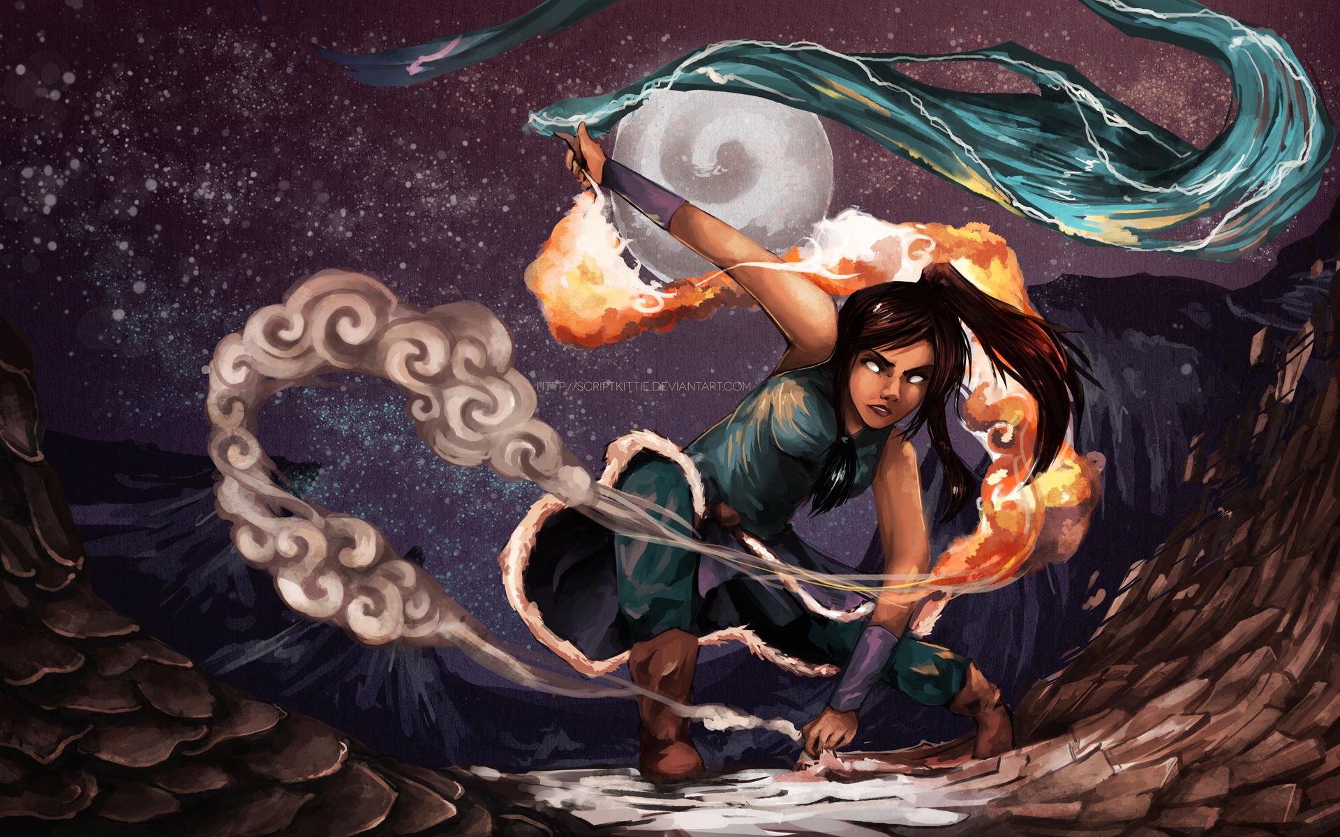
NEW SEASON COMING UP!!!! www.hypable.com/2013/07/19/the...
Image size
1920x1200px 1.8 MB
© 2013 - 2024 scriptKittie
Comments15
Join the community to add your comment. Already a deviant? Log In
This piece is really nice. I love your painting technique - you have a really unique style that's polished, but organic. One thing I notice is that the back leg looks a bit awkward. The pose looks pretty uncomfortable because of that, but all other parts of the anatomy look fine. Because the surrounding scenery is fairly ambiguous. I don't immediately recognize where she is (geographically in terms of the show), which is okay in this instance because it doesn't detract from Korra as the focal point. I'd like to see her given more weight/importance, though. The rock/lava(?) on the left seems to have as much emphasis as she does, probably because of its size. Also the motion of it makes it hard for me to decide which part is the earth element, though I'll go with the harder looking rock on the right since it has a lot more motion.
Another thing I'd want to fix up is that because of the different directions the elements are going in, my eye has a bit of a hard time deciding where the flow of the composition is supposed to be. At first, I focus on Korra, because she is the main focus, and then my eyes kind of do this awkward zig zag down the middle of the piece, because the directions of the water, fire, earth, and then air, go in opposite directions.
Your use of texture is really nice, and the background (all the stars and mountains) look really beautiful. The moon looks like it might be a tad big, but just barely. It seems a tiny bit unbalanced to me, and I would want to see it a little dimmer, since Korra's in the avatar state, which makes me feel like her eyes would be a lot brighter than the distant moon. After covering the left corner with my hand I feel like the composition might have been a lot more balanced without that lava/rock formation there, maybe with Korra more toward the middle/left of the composition. It seems really heavy on the right side when you look at all the elements and Korra, and on the left there's a lot more negative space, so the balance looks clunky.
This piece is really nice and I think that you are going in a really good direction with your art as I see you do more of it. You've come a long way and I think you have a long way yet to go. Your shading, highlighting and use of color is excellent, and your painting techniques look beautiful and harmonious. The elements look great, in particular. I hope my critique wasn't too heavy handed, and I hope to see you improve even more in the future! <3