ShopDreamUp AI ArtDreamUp
Deviation Actions


Suggested Deviants


Suggested Collections


You Might Like…


Description
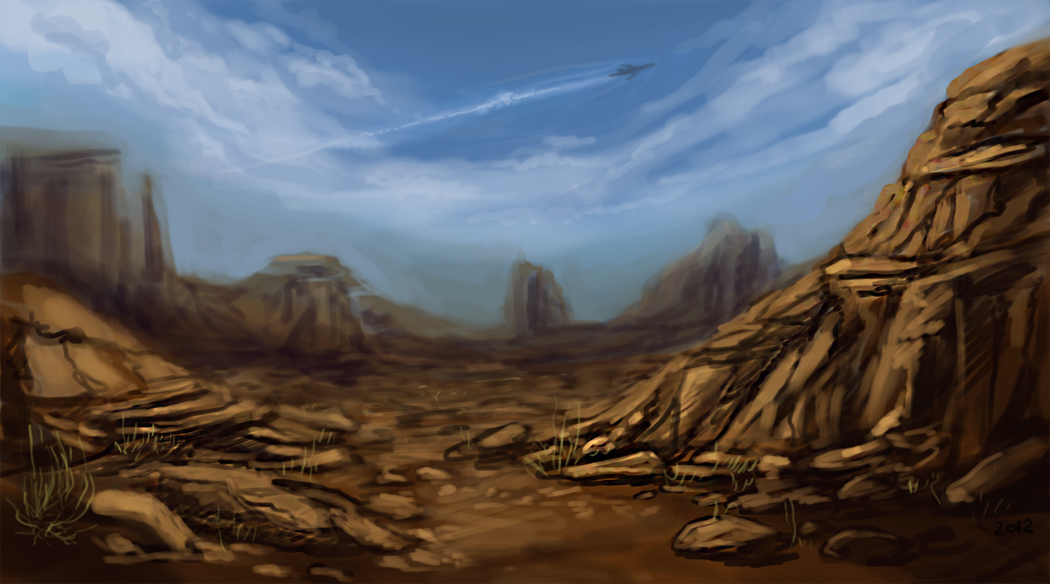
I usually don't upload studies and such but I guess I should if I want feedback lol.
I'd like help with the lighting and atmosphere please.
I know that it's kind of dark in coloration, but what would make it look better?
Time: ~45 minutes
Layers: Three
Program: Adobe Photoshop CS5
I'd like help with the lighting and atmosphere please.
I know that it's kind of dark in coloration, but what would make it look better?
Time: ~45 minutes
Layers: Three
Program: Adobe Photoshop CS5
Image size
1050x584px 749.23 KB
© 2012 - 2024 Policide
Comments26
Join the community to add your comment. Already a deviant? Log In
I think you need a lot more colours in there. Find a photo and just go crazy with the colour picker tool. Go all over it and observe all the colours that you can find and their value/saturation.
Choosing the right colours for your background is really hard and takes a lot of experience... sometimes going over the colour you've chosen with a low opacity purple or blue can give you a better shade.
That foreground looks too saturated to be realistic. Once you've set your base colours and started detailing, you could using the colour picker to get colours from your painting, instead of choosing them from the slider again. I tend to always pick more saturated colours myself, so this helps me keep it more real!
Also, do you use the smudge tool? I think you should avoid that (if you do), it kind of leaves your image textureless and murky. Try and blend by using the colour picker (hold alt, this shortcut did wonders for me once I started using it) a lot and brushing in between the two colours with low pressure. I hope you... got my lousy explanation. ;~;
I'm not very good at backgrounds yet, but these are the things I've picked up along the way, I hope it helps!