ShopDreamUp AI ArtDreamUp
Deviation Actions
Daily Deviation
Daily Deviation
October 25, 2007
*novenarik's illustrations have a warmly tactile feel and a painterly flow that is uncommon in vector art, Flesh Tone Tutorialish offers some instruction on how to take your shading to a more sophisticated level.
Featured by bleedsopretty
Suggested by wroth


Description
Sometimes when i get really bored, and can't think of anything to draw -- I like to practice things like flesh tones, hair, etc. This is the result of one of those times.
The reason though that I upload this, is that when going through a lot of the pieces of vector work in the galleries, I notice a lot of beginners really struggling with shading, coloring, etc.
And I think all it really comes down to is two stumbling blocks:
1. In most drawing applications, there is just SO much you can do, not necessarily things you *should* do, but just so may options. And I think you can get really bogged down with all the options: gradients, gradient meshes, styles, filters, brushes, strokes, etc etc etc. Things that complicate the piece to an unnecessary degree, and quite frankly, make the piece look like shit.
2. A lot of people, when asking me about technique and crap, do not realize just how much the program (at least in illustrator) can do for you when it comes to blending and color management. Most people don't realize that Illustrator has nearly all the same blending options the photoshop offers, although some function a little differently. When drawing a piece, they manually rummage through their palette trying to mix the exact right shade for shadows, the perfect color for highlights -- and it leaves SO much room for error, i.e., flesh shading containing weird amounts of cyan, maybe jaundicey, etc.
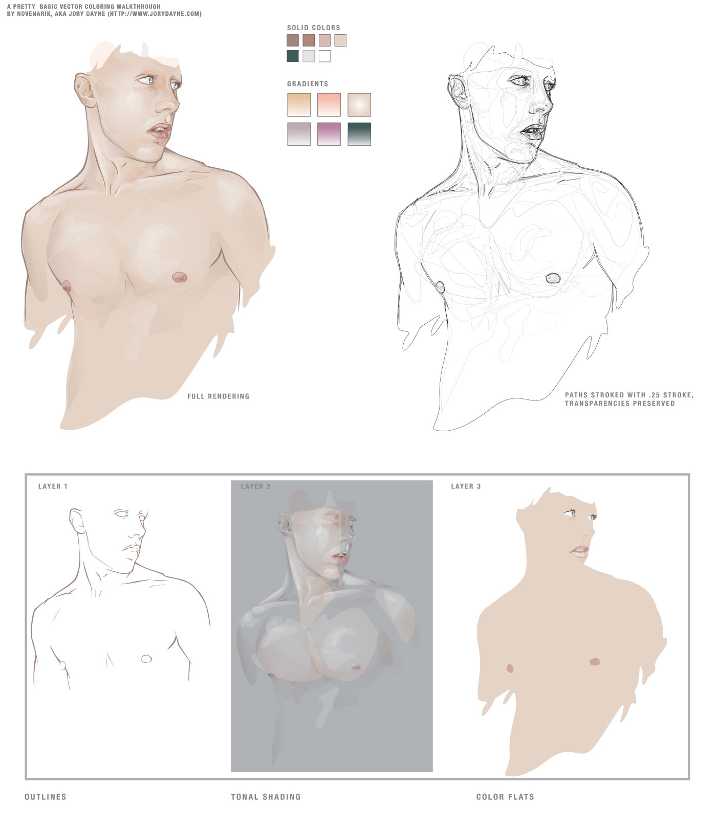
SO -- for this piece, I grabbed a pic out of the stock collections here at DA and basically had one goal in mind: render a quality image, simultaneously extremely complicated and ridiculously simple.
-----------------------
The image at left is composed of 13 'colors' - 7 solid colors, and 6 gradients. I did the outline on one layer, the flat colors on one layer below, and the tones on a layer above it. I tried to keep the tones very warm, and very homogenous.
Now, illustrator's 'Screen' blending mode works a little differently than photoshop's (where black is transparent, and everything else basically lightens the color beneath it) -- In illustrator is basically lightens everything all to hell -- black still lightening things as well. For this reason, I find it usually works better, to work with a simple gradient, one color blended to white, and then its transparency adjusted. And also, do the highlights *first* immediately on top of your flat colors. It makes blending so much simpler, the highlight is created by a screened shade of the exact same color beneath it -- so the highlight is precise; you don't have to worry about matching your colors over and over and over again -- since you basically have one color beneath it.
Transparencies is another key issue -- you can fade your shading in and out until you get some extremely subtle shifts -- sooo many people keep going back to that palette and tweak their colors until its just a hint lighter, but its sloppy and slow -- the transparency palette is your friend.
Anyway, next I go in and do all the shading -- typically with gradients, one color to white, blended with the "multiply" mode -- again, the shading will blend perfectly with the colors beneath it -- and you don't get any weird rastery lines on your edges. You can really go nuts at this point -- the multiply mode works exactly like it does in photoshop, so with white as one color in your gradient, you essentially are getting a perfect shade to transparent wash over your flat tones and highlights.
-------------------
The image on the right is just the image on the left, all the colors stripped out, each path stroked with a quarter-width stroke -- I've left the transparencies intact, so you can see which paths had which opacities.
The images underneath are the three layers I mentioned earlier:
Layer 1 (the first layer I created): the outlines
Layer 2 (the third layer): All shading and highlights -- anything that is a gradient, or blended, or not 100% opaque
Layer 3 (the second layer): color flats, basic full opacity washed of color.
Document Info:
454 Paths, 383 of which have are 99% opaque or less, 264 of which are gradients. 0 gradient meshes, 0 brush effects, 0 filters, 0 stylized objects, 0 stroked objects.
So thats a pretty concise, and albeit broad tutorialish walkthrough of shading -- play around with blending modes, transparencies and limited palettes and see what you come up with. It mostly a system of trial and error that you get the hang of the different modes, etc. I hope I didn't sound cocky or authoritarian -- i was going for just helpful.
The reason though that I upload this, is that when going through a lot of the pieces of vector work in the galleries, I notice a lot of beginners really struggling with shading, coloring, etc.
And I think all it really comes down to is two stumbling blocks:
1. In most drawing applications, there is just SO much you can do, not necessarily things you *should* do, but just so may options. And I think you can get really bogged down with all the options: gradients, gradient meshes, styles, filters, brushes, strokes, etc etc etc. Things that complicate the piece to an unnecessary degree, and quite frankly, make the piece look like shit.
2. A lot of people, when asking me about technique and crap, do not realize just how much the program (at least in illustrator) can do for you when it comes to blending and color management. Most people don't realize that Illustrator has nearly all the same blending options the photoshop offers, although some function a little differently. When drawing a piece, they manually rummage through their palette trying to mix the exact right shade for shadows, the perfect color for highlights -- and it leaves SO much room for error, i.e., flesh shading containing weird amounts of cyan, maybe jaundicey, etc.
SO -- for this piece, I grabbed a pic out of the stock collections here at DA and basically had one goal in mind: render a quality image, simultaneously extremely complicated and ridiculously simple.
-----------------------
The image at left is composed of 13 'colors' - 7 solid colors, and 6 gradients. I did the outline on one layer, the flat colors on one layer below, and the tones on a layer above it. I tried to keep the tones very warm, and very homogenous.
Now, illustrator's 'Screen' blending mode works a little differently than photoshop's (where black is transparent, and everything else basically lightens the color beneath it) -- In illustrator is basically lightens everything all to hell -- black still lightening things as well. For this reason, I find it usually works better, to work with a simple gradient, one color blended to white, and then its transparency adjusted. And also, do the highlights *first* immediately on top of your flat colors. It makes blending so much simpler, the highlight is created by a screened shade of the exact same color beneath it -- so the highlight is precise; you don't have to worry about matching your colors over and over and over again -- since you basically have one color beneath it.
Transparencies is another key issue -- you can fade your shading in and out until you get some extremely subtle shifts -- sooo many people keep going back to that palette and tweak their colors until its just a hint lighter, but its sloppy and slow -- the transparency palette is your friend.
Anyway, next I go in and do all the shading -- typically with gradients, one color to white, blended with the "multiply" mode -- again, the shading will blend perfectly with the colors beneath it -- and you don't get any weird rastery lines on your edges. You can really go nuts at this point -- the multiply mode works exactly like it does in photoshop, so with white as one color in your gradient, you essentially are getting a perfect shade to transparent wash over your flat tones and highlights.
-------------------
The image on the right is just the image on the left, all the colors stripped out, each path stroked with a quarter-width stroke -- I've left the transparencies intact, so you can see which paths had which opacities.
The images underneath are the three layers I mentioned earlier:
Layer 1 (the first layer I created): the outlines
Layer 2 (the third layer): All shading and highlights -- anything that is a gradient, or blended, or not 100% opaque
Layer 3 (the second layer): color flats, basic full opacity washed of color.
Document Info:
454 Paths, 383 of which have are 99% opaque or less, 264 of which are gradients. 0 gradient meshes, 0 brush effects, 0 filters, 0 stylized objects, 0 stroked objects.
So thats a pretty concise, and albeit broad tutorialish walkthrough of shading -- play around with blending modes, transparencies and limited palettes and see what you come up with. It mostly a system of trial and error that you get the hang of the different modes, etc. I hope I didn't sound cocky or authoritarian -- i was going for just helpful.
Image size
1405x1615px 141.14 KB
© 2004 - 2024 novenarik
Comments152
Join the community to add your comment. Already a deviant? Log In
Thanks for your help back in 2k7 now that i needed it in 2013.