ShopDreamUp AI ArtDreamUp
Deviation Actions


Description
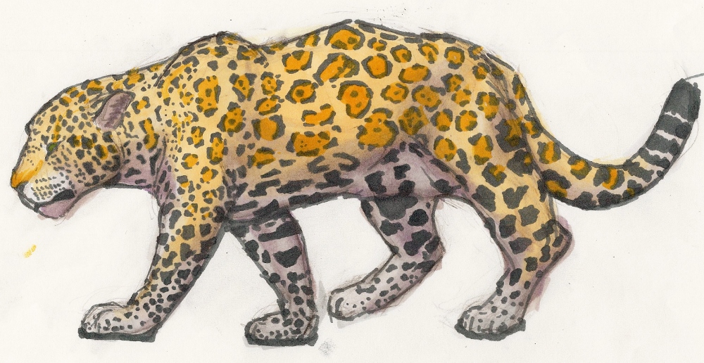
So I had a project for Atelier, an art mentoring site, to draw something starting with the letter of your name. Well, my real name starts with a J, so here's a jaguar.
I had a few goals in mind and I'm not sure I accomplished all of them, but I am happy with what I did create.
I went out first of all to get a good animal drawing. I think I did that. I think it feels like it is or could be moving, though in a bit of a more passive position. It also has the bulk that is distinctive to jaguars (as opposed to leopard). I think I also did a decent job at getting the loose skin at the stomach.
I also tried to get a little bit of design there. I think I could have done that a little better. I do have more rectangular than round shapes to add to the solidity, but I could have done better. (This reappears in the spots some: I tried to really get a more square than round shape.) The spots would a little more exaggerated if I hadn't been fighting the color scheme.
It's a little hard to see from the scan (forgive me, I don't have Photoshop at the moment), but I went with a pale yellow and purple for the color scheme. Well, belatedly I realized I didn't have a quite light enough purple. It turned out well, though I hated it before I re-outlined it and added the spots. The dark yellow/orange of the spots is a bit lighter and more subtle in real life, but what can you do?
I had considered doing a simpler yellow-cream-brown color scheme that I think would have given me a bit more freedom in terms of pushing shapes.
As I said, overall I'm happy with it.
Image size
1000x516px 350.16 KB
Date Taken
Feb 21, 2014, 11:51:31 PM
© 2014 - 2024 Nortya
Comments8
Join the community to add your comment. Already a deviant? Log In
Very well done!