


Digital Art Week
Hello everyone and welcome to Digital Art Week! I'm ArtCrumbss, a digital and traditional artist. I'm currently a freelancer and resident artist for Wacom and Graphixly (Clip Studio). Essentially I help out at conventions by demoing the tablets and art software. :'D NykolaiAleksander invited me to talk to you guys, so here I am! Our Digital Art Week this time will focus on animals, creatures and humans! I'll be covering fur and hair done digitally, specifically in Clip Studio, but if you are savvy enough, this will all apply to other digital programs as well! Let's get started.
Digital Fur: A Variety of Looks
These are two of the examples I will be covering today.
1. Texture and Shape
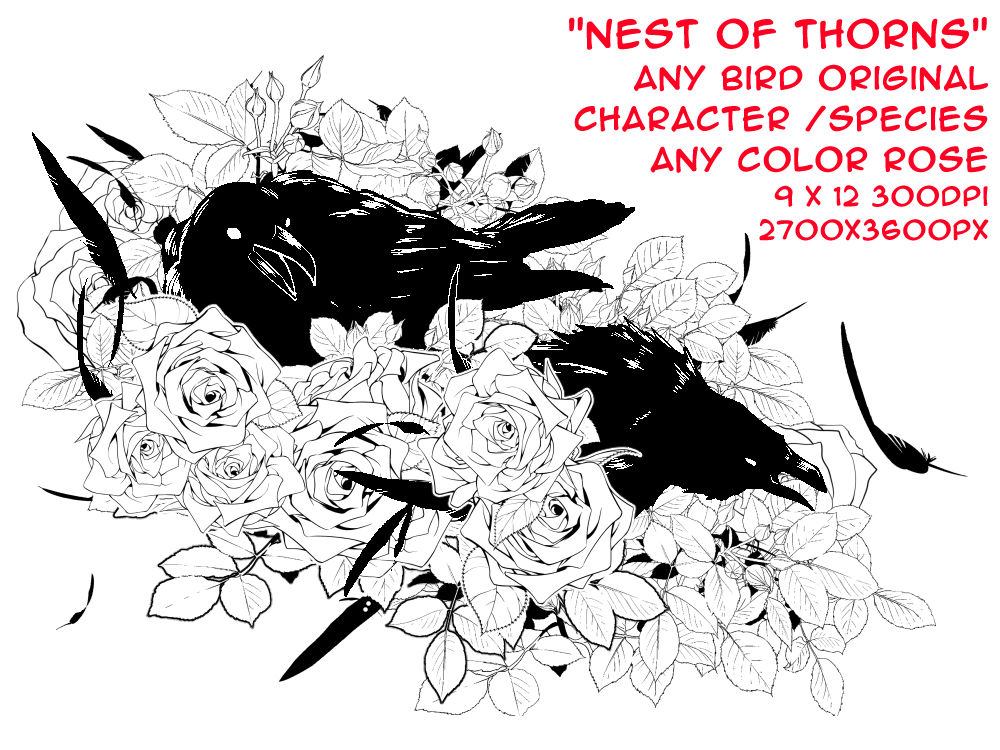
Fur comes in all shapes and textures. This applies to all creatures whether wild, domestic, even people! This deviation by Deskleaves is a great example of a wide variety, and not even all of them! Birds are a bit different due to feathers, which I won’t be covering, however some birds, like flightless birds (my character Koko above), have feathers that appear more like fur. Anyway, what kind of fur or hair do YOUR characters have?! Compare them here:
This matters because depending on the texture will determine on how you shade and color the fur/hair on your art.
So pay attention class!
If you can, try to make a special list that lets you identify this on your characters for future reference. To add, a single character can have a variety of types on their body.


Here are some examples from the two examples posted earlier. This applies to any creature, hell even some PLANTS have fur or hairs and vary in fibers when making papers. So taking the time to learn about them can help with your artwork in all sorts of ways. When sketching and planning out your drawing, be sure to include the type of fur, I planned out these fur/hair types in the sketch. While and doing lineart, I was far cleaner and paid attention to line weight, which I will discuss later. It doesn’t have to be absolutely perfect in the sketch, but at least identify what sort of hair and texture.
Thinking of these things will REALLY help your artwork looking more realistic.
2. Growth Direction and Color Changes
The next thing to keep in mind, is not only what sort of texture the fur has, but what direction it flows in. Fur and hair don't just magically sit on the body. They follow specific physics and are general patterns. Of course these may change based on exact species or breeds, so always look up references if possible to determine these patterns!
While sketching if it helps,, you can draw the arrows with your sketch and do smaller studies to practice these patterns. If you have a pet or other animals you work with, check them out, you might notice a neat pattern!
Humans have this as well! Most hair starts in the back of the head and whorls, especially visible in those with short hair. Longer hair people usually have a part on one side of their head or at the top. People can also TRAIN their hair to part certain ways. So when designing characters and animals, keep that in mind. This goes for facial and body hair too!
Here are some examples of animals for you!

In addition to direction, another thing to think about is the seasons, a lot of animals change seasons. Wolves for example have different coats for summer and winter. My own cat, Miso, changes fur in summer and winter. I mention this because these seasonal changes affect the growth of the hair and often can make radical changes in the creature. These changes have a purpose, so when doing characters that live in certain environments like cold, arctic tundras or even the oceans (many fish change), keep that in mind as well! It'll make your characters interesting!
Here are some examples for you:
Winter on Left / Summer on Right

Summer on Left / Winter on Right

Now that we know a little bit more about how
to look and think about fur and hair, let’s look at
ways to draw and color it!
3. Fur and Hair in Different Art Styles
There are a TON of ways to do this. I'm going to cover a few "basic" styles below.
1- Hair of the Dog Technique -
Essentially you draw every single hair, very detailed and tedious work. I did this in one of my classes at Ringling (Art college). It is a neat technique, and pretty easy. Here are some great examples I found on here on DeviantART. Good job on these wonderful artworks Deviants! 


2- Painting /Suggestive -
This can be more abstract or literal. There are a LARGE variety of ways this can be done. Usually done in clumps, or chunks to suggest hair and fur. There are a million ways to do this, so feel free to experiment!


3- Cel Shading (Soft and Hard) -
This comes in two forms, soft and hard cel. The main difference between the two is that soft cel has softer spots throughout the image. Hard cels are hard defined lines between light an shadow. It can still allow for bounce light, so the two has a mix of possibilities, but generally the same look. Gradients are common method here. This is typical for cartoons, manga, anime and other animation style due to the easy nature of drawing. Drawing painted or complicated shading techniques can be very difficult when having to draw 24-30 frames per second, which is standard for animation. I personally use a soft style mixed with screentones, like the first style above.
Soft


Hard


4. The Actual Process of Drawing
Now, I do a sort of cel shading, typically soft cel, so I cannot help much personally in terms of how to do this with a painting style or a Hair of Dog style. I'll do the best I can to make it easy.
Sketching and Inking
These are similar in terms of method. For me the main difference is quality of line. The sketches are more free and focused on idea, not precision. Figuring out what type of lines and fur is along each part of the body and the direction it is going against the body, you can compare them here! I also color my lineart, this is a beneficial technique as black lines can flatten/deaden the artwork. Giving it color can give it more life, look more 3D. I usually use colors for the lineart that are already in the artwork. In this example, I used a dark fuchsia (a dark reddish purple) as it was a color I would use for shading later on the fur. So try to select your colors carefully.
Keep in mind that when it comes to lineart in the CEL style that LINE WEIGHT matters. The fact we have bold text as a formatting proves my point about line weight). Line weight is essentially the thickness of the line. Notice in the above image that not all lines are the same, sometimes I lower the opacity or shrink the actual size of the brush tip. This can help with defining light as well as quality.

The whisker and chin hairs are light and thin, versus the hair right at the neck. It is thicker and darker in appearance. It goes with the shadows I have planned for the lighting and shading in the later process.

Don't forget to color your lineart too! I did a nice reddish brown which you can see in the whiskers most noticeably.
Base Colors and Markings
Typically the next step is to fill in the base color. I try to never use a fully saturated color. The circle around the triangle is the hue, the line going from golden to black is value from hue to black, and the line going from white to black is simply value with no color at all.

Fills can be done by selecting with the magic wand tool outside the area, then inverting the selection.
This will select the space inside.

Once you have the outside area selected, pick your color and then go to Edit > Fill OR hit ALT+Delete to fill.

This is our result. Everything is filled in with nothing out of the characters form (ignore the bits under the flowers).

Now that we have the basic form down, we need to add markings. A lot of animals AND humans have multiple colors on their hair/fur. The easiest way to add this without going outside the color already laid down. Easy peasy, this technique can be used in Photoshop as well. Make a new layer and name it “markings”. SELECT THAT LAYER. Then hover your mouse over the layer preview/icon of your color base, hold the CTRL/CMD button and click the mouse ONCE. This will select everything that IS NOT TRANSPARENT in that layer, our color base layer. Then you will look above at the menu for a rectangle with a white circle... THIS is your “Create a Mask” button. Make sure your markings layer is still selected and then click that button. It should have a result like the right image. The pixels of that layer that are WHITE will show through, the black will be BLOCKED. That's how I remember, kinda like a digital stencil!

Now we can color in and add markings without worrying about “going outside the lines”. So now I will go ahead
and do my own markings on my Ahk character. Now that we have a layer mask to make sure we don't go outside our lines, we need to go ahead and fill it Ahk's markings. He has some markings on is face, ear, some socks on his front legs, stockings on his back legs and then some on the tip of his tail. Cutie yeah? Below is an example of how the fills work and then the result of putting in his markings. I also put the brown markings into Linear Burn afterwards to get the color I wanted. 

Screentones
Now this next part is a personal touch, but with coloring I like to put in screentones. What is a screentone? They are the lined or dotted patterns commonly seen in pop art, manga and comics. They are also called halftones or zipitones depending on who you talk to and what sort of work they do. This portion is optional, it's not needed for shading or coloring of fur, unless you are using a manga/comic style that involves this sort of tool. Read it and learn something new or you can move on to the next part of this "Shading and Lighting" which is below.
Clip Studio (both Pro and EX) has a tool for this. But first, make a copy of your markings later in CSP, you can do this by Clicking on the layer and dragging it to the "New Layer" icon on the far left (looks like a white sheet of paper with a bent corner). OR you can go to the very very top left corner of the "Layers" window and click on the arrow that points to the 3 lines. This is your "layer options menu". Then click on "Duplicate layer". This will make a copy of the layer as shown below. Make sure your second layer is send to NORMAL blending mode, NOT anything else, for now anyway.
Then when you have that, make sure your markings color is still your foreground color (meaning in your color wheel it is still the top of the two colors. See below on the right image. Got it? Great, now go to the "Layer Properties" window, it should be above your layer panel. There will be a checkerboard pattern and you are going to click that specific icon.
If for some reason you cannot find it or it is not open, go to the top menu and go to Window > Layer Properties.
 THEN >>
Once we click on the tone button (checkerboard button), the options for this change and our layer gets a checkerboard icon on the right. This is to let us know this is now a tone later. You will also notice that the layer is likely forced into Black and white! No worries we got that part, that's why I had you pick your color earlier. :'D You will need to click on the blue and white icon to the right of the tone icon. This may initially turn your layer blue, but this is a default. Hover your cursor over the layer color (blue) and click it to "fill" the bar with the color you chose earlier.
Now your screen tone layer should be the color you want it to be!
 >>>>
>>>> 
This next part is going to be up to you guys entirely as every single image is going to be unique. At the top of the layer Property panel you will see "Number of Screen Frequency". To explain this as easily as possible, essentially this changes how close or far apart the dots are. Slide this left and right until you see a look that you like. I will put mine to about 36.9 and Cross for the dot settings (not circle like the screenshot), however you might use something different. "Density" is not something we are going to worry about right now, but you can play with it if you wish. Dot settings is neat! You can have a very different look for each option. You can choose from lines, to dots, or hatching to even stars and cherries! Very fun to play with!
This might look like a weird pattern, almost plaid based on the screenshot you see here, but that doesn't mean the final will look like that. if you zoom in, you will likely see it change. This odd plaid-ish or any odd pattern you see in your screentones is called "Moire pattern". It usually has to do with resolution, which is why it vanishes upon zooming in. Check the "final size" of your imagine either my zooming into it or changing the actual image size if you don't work at final. For example, I work 4x bigger than the final size, which means I need to see how the image looks at 25%. When I zoom in to 25% it looks just fine, so I'll have to be mindful of that when saving the final, but so far it'll be ok. :'D
Now we get to move on to shading and lighting!
Shading and Lighting
The real meat of the issue is here, so hold in tight guys, it actually isn't a large portion, I promise. I don't do a ton of work on shading and lighting. Typically I'll use the Airbrush tool, gradients, pen, and eraser (soft) to do my shading. But enough talking, let'sa go!
To start, I'll put all my shadows in as a HARD LINE, again this is cel shading, I'll soften some of these edges later. I pick my shadow AND light colors, I want to keep them realistic and not flat, especially since healthy fur and hair are so radiant. I choose a warm purple for the shadows and a bright pale yellow. This may see odd with him already being a yellow, but I'm confident it'll work out well. If not it is an easy change later with my "layer color" option that I covered in the screentone section.
So now I have this with just my shadows in hard cel form. I'll go and soften some edges to get that nice soft cel look and then do the same to my highlight. How do I get those softer edges (most visible in the tail and forearm opposite of us)? I go along the edges with a blend tool (looks like a set of black and white droplets) on, usually I set mine to Soothing watercolor or Fingerpaint, I typically put the same settings to both, 50/50 on stretch and density. This keeps it someone transparent, but doesn't pull too much to make it look like I grabbed a glob of acrylic paint and speared it around. Don't forget the post of this part is to BLEND and great the illusion of fur. This semi-transparent look is great for getting fur-like strokes.

I also used a soft eraser brush on the shadows of the tail near where the tail begins to bend to the right. This adds dimension to the shadow and doesn't make it look so flat. I do this also with the highlights, most visible along the thigh and tip of the tail. There are also points, most notable area is in the tail. I use the eraser, I will use a hard shape to get the patches of light in there. This also helps with the 3D look. However these colors look pretty harh, I dimmed them down by lowering the opacity on them both and put the highlight layer on "Linear Light" to get the exact look I wanted.


Almost there guys! There is only one little portion left to really make this lighting look really vibrant. Adding additional lighting on the underside called "bounced light" will be great! It will also cool it down the shadows as they are a bit warm at the moment. First of all, I added a light blue over some areas of Ahk, like the neck under his chin, the shadows of his tail, his underbelly near his elbow, and his tail near where it tucks behind the flowers. I will set this layer to multiply to help darken it, but being a light blue, it will only darken it a little. Just enough to add a cooler shadow to the fur and really make it look more 3D.
By contrast, I added a white over some parts of the rump just underneath the large flower, his forehead and shoulder right under his chin. I will set the Light White layer to Add Glow to make those highlight really pop, but at the same time not saturate them too much, thus why I chose the white.


After we add effects, like some floating white orbs to give off a bit of a glow, it changes a lot! Give it a sort of glowing life. I adjust the curves and contrast a little and it's done! Check it out below!
Summary
Now We are going to review what we covered.
- Fur and Hair has a lot of variation in texture, shapes, and lengths. Vary it up on your characters for neat designs.
- Fur and Hair grows in patterned directions, which also vary by species and sometimes individuals!
- Fur can change colors and thickness by seasons! You can add this to make it seem more natural and realistic.
- There are lots of techniques for fur and hair, the 3 I listed are not ALL of them, but common ones. Try them all out.
- Try to plan your hair and fur in the sketching stage, this will make it easier later as you ink and color.
- When inking, try line weights and colored line art to really make it pop and add more dimension to your work.
- When putting in colors, starting with a base and using a mask for markings makes "staying in lines" much easier.
- Screentones can add a nice touch and texture for a pop look or for those of the comic, manga or cel style!
- When adding shading, consider when you need hard and soft shadows, especially if working in a cel style!
- Adding bounced light and glows are one way to add an extra dimension and real vibrancy to your piece.
I hope that this was educational for you guys. I certainly learned some things putting this together and I again thank NykolaiAleksander for inviting me to write for projecteducate. Thank you again!
Thank you! So much for reading!
Please leave any comments for me with questions.


