Site Header
ShopCreate a videoAI Video
Deviation Actions







Description
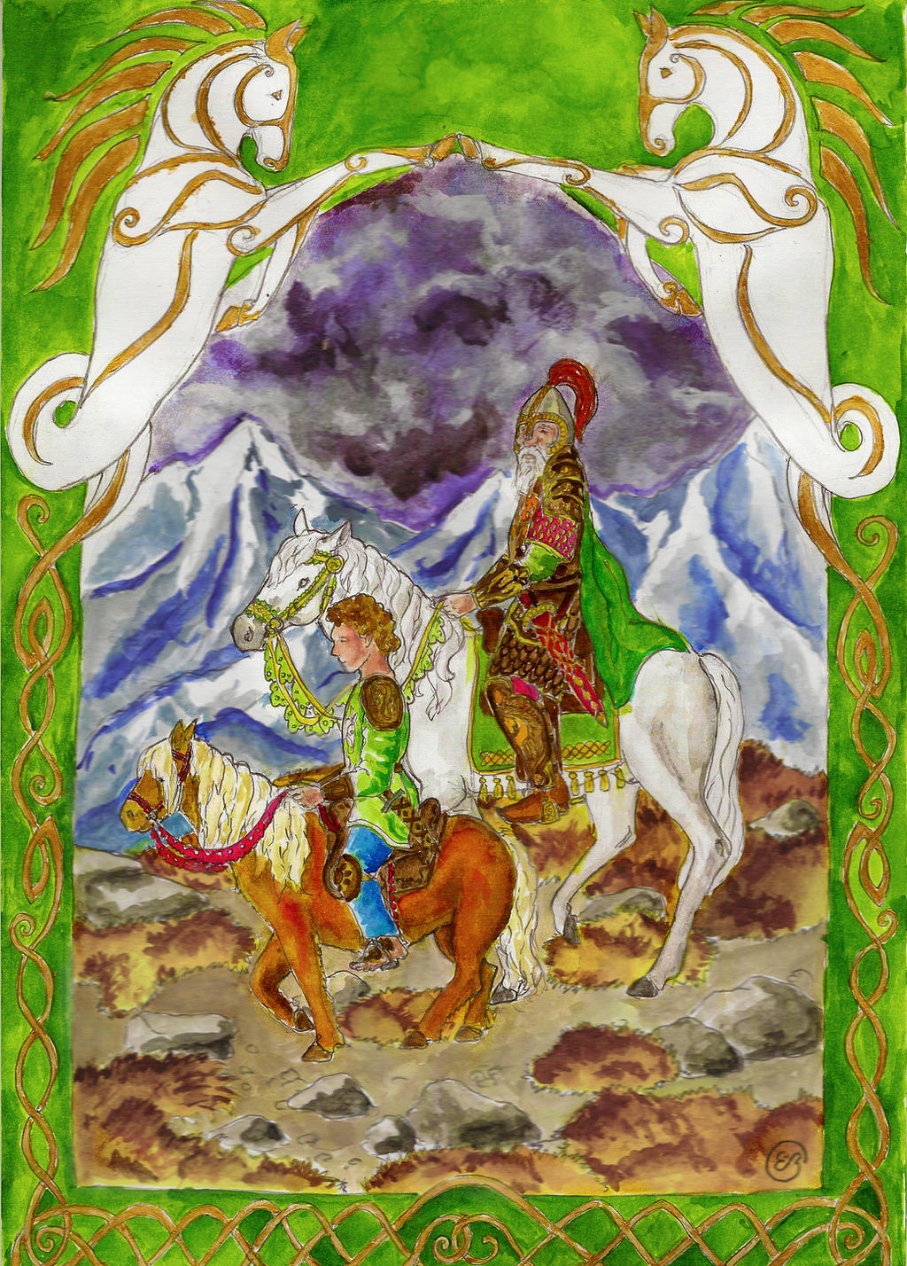
‘As a father you shall be to me,’ said Merry.
‘For a little while,’ said Théoden.
On the way to Dúnharrow: Théoden rides Snowmane, and at his side is Merry on his pony Stybba. This is my mental picture of them, uninfluenced by the movies. I always imagined Théoden looking older than in the movie (although younger than in the movie under Gríma's influence... he looked a bit too mouldy there...).
Art-trade with . I didn't mean it to get this detailed, honestly. It just, sort of... happened
 Done with aniline watercolours... and the scanner cut a bit from the bottom.
‘For a little while,’ said Théoden.
On the way to Dúnharrow: Théoden rides Snowmane, and at his side is Merry on his pony Stybba. This is my mental picture of them, uninfluenced by the movies. I always imagined Théoden looking older than in the movie (although younger than in the movie under Gríma's influence... he looked a bit too mouldy there...).
Art-trade with
. I didn't mean it to get this detailed, honestly. It just, sort of... happened Done with aniline watercolours... and the scanner cut a bit from the bottom.Image size
2467x3440px 7.89 MB
© 2013 - 2026 MirachRavaia
Comments32
Join the community to add your comment. Already a deviant? Log In


 Overall Vision Originality Technique Impact
Vision/Impact: The scene conveys your idea fairly well, like a little moment when Theoden looks down kindly at Merry. But could have been arranged differently to bring their relationship into focus a bit better, and have more emotional impact, for instance having Theoden ahead of Merry with him looking over his shoulder and Merry meeting his gaze.
Originality: I like that you are inspired by scenes in the movies without actually trying to duplicate a movie still. Using your own ideas about how they should look to change things.
Technique: I'll be talking about quite a few things here. First, the composition is nicely balanced, figures are well proportioned and nicely detailed. Secondly, your vibrant, clear colors are very nice! There is something about Middle-earth that just begs for this kind of coloration. Watercolor is a difficult medium to master, yet you have rendered Shadowfax with very nice, subtle gradations of gray, offering a nice contrast to the roan-colored pony. But there is not enough contrast in overall value to make your subject stand out from the background. Painted in the traditional way as you have here, the sky should be paler near the horizon and the mountains should be pale and misty, and somewhat less detailed, to give the illusion of distance.
One way to check if your subject is standing out enough is to scan it and view it in (large, if you have Win7) thumbnail size. If you cannot differentiate the subject from the background in a thumbnail then you know there is not enough contrast.
There are 3 ways (off the top of my head) to achieve contrast: value (light/dark), hue (color brightness/dullness or warm/cool colors), and texture (line width and detail). Any one or all three can be used to make your subject into a focal point.