ShopDreamUp AI ArtDreamUp

Deviation Actions


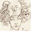
![hUNTER [ai]](https://images-wixmp-ed30a86b8c4ca887773594c2.wixmp.com/f/8c52d74c-182c-4089-a9c2-4a742f1f4ebd/dgpxgxr-c9f23039-906a-4449-b9a6-d33cfded7baf.jpg/v1/crop/w_184,h_184,x_19,y_0,scl_0.27058823529412,q_70,strp/hunter__ai__by_ghost999919_dgpxgxr-92s-2x.jpg?token=eyJ0eXAiOiJKV1QiLCJhbGciOiJIUzI1NiJ9.eyJzdWIiOiJ1cm46YXBwOjdlMGQxODg5ODIyNjQzNzNhNWYwZDQxNWVhMGQyNmUwIiwiaXNzIjoidXJuOmFwcDo3ZTBkMTg4OTgyMjY0MzczYTVmMGQ0MTVlYTBkMjZlMCIsIm9iaiI6W1t7ImhlaWdodCI6Ijw9NjgwIiwicGF0aCI6IlwvZlwvOGM1MmQ3NGMtMTgyYy00MDg5LWE5YzItNGE3NDJmMWY0ZWJkXC9kZ3B4Z3hyLWM5ZjIzMDM5LTkwNmEtNDQ0OS1iOWE2LWQzM2NmZGVkN2JhZi5qcGciLCJ3aWR0aCI6Ijw9OTY4In1dXSwiYXVkIjpbInVybjpzZXJ2aWNlOmltYWdlLm9wZXJhdGlvbnMiXX0.9-_TFawOJPY1_yUnaqYiW-oKX0pT3QlPw2LOBsSr23s)
![hUNTER [ai]](https://images-wixmp-ed30a86b8c4ca887773594c2.wixmp.com/f/8c52d74c-182c-4089-a9c2-4a742f1f4ebd/dgpxgxr-c9f23039-906a-4449-b9a6-d33cfded7baf.jpg/v1/crop/w_92,h_92,x_10,y_0,scl_0.13529411764706,q_70,strp/hunter__ai__by_ghost999919_dgpxgxr-92s.jpg?token=eyJ0eXAiOiJKV1QiLCJhbGciOiJIUzI1NiJ9.eyJzdWIiOiJ1cm46YXBwOjdlMGQxODg5ODIyNjQzNzNhNWYwZDQxNWVhMGQyNmUwIiwiaXNzIjoidXJuOmFwcDo3ZTBkMTg4OTgyMjY0MzczYTVmMGQ0MTVlYTBkMjZlMCIsIm9iaiI6W1t7ImhlaWdodCI6Ijw9NjgwIiwicGF0aCI6IlwvZlwvOGM1MmQ3NGMtMTgyYy00MDg5LWE5YzItNGE3NDJmMWY0ZWJkXC9kZ3B4Z3hyLWM5ZjIzMDM5LTkwNmEtNDQ0OS1iOWE2LWQzM2NmZGVkN2JhZi5qcGciLCJ3aWR0aCI6Ijw9OTY4In1dXSwiYXVkIjpbInVybjpzZXJ2aWNlOmltYWdlLm9wZXJhdGlvbnMiXX0.9-_TFawOJPY1_yUnaqYiW-oKX0pT3QlPw2LOBsSr23s)


![devil [ai]](https://images-wixmp-ed30a86b8c4ca887773594c2.wixmp.com/f/8c52d74c-182c-4089-a9c2-4a742f1f4ebd/dgrcvl9-3f6bc462-5f25-4f85-8659-6ec107d18ef5.jpg/v1/crop/w_184,h_184,x_0,y_0,scl_0.1796875,q_70,strp/devil__ai__by_ghost999919_dgrcvl9-92s-2x.jpg?token=eyJ0eXAiOiJKV1QiLCJhbGciOiJIUzI1NiJ9.eyJzdWIiOiJ1cm46YXBwOjdlMGQxODg5ODIyNjQzNzNhNWYwZDQxNWVhMGQyNmUwIiwiaXNzIjoidXJuOmFwcDo3ZTBkMTg4OTgyMjY0MzczYTVmMGQ0MTVlYTBkMjZlMCIsIm9iaiI6W1t7ImhlaWdodCI6Ijw9MTAyNCIsInBhdGgiOiJcL2ZcLzhjNTJkNzRjLTE4MmMtNDA4OS1hOWMyLTRhNzQyZjFmNGViZFwvZGdyY3ZsOS0zZjZiYzQ2Mi01ZjI1LTRmODUtODY1OS02ZWMxMDdkMThlZjUuanBnIiwid2lkdGgiOiI8PTEwMjQifV1dLCJhdWQiOlsidXJuOnNlcnZpY2U6aW1hZ2Uub3BlcmF0aW9ucyJdfQ.jWM86lwNaPU2rIgr5rjf66NSU5D6YRGMqTJE_YNybnk)
![devil [ai]](https://images-wixmp-ed30a86b8c4ca887773594c2.wixmp.com/f/8c52d74c-182c-4089-a9c2-4a742f1f4ebd/dgrcvl9-3f6bc462-5f25-4f85-8659-6ec107d18ef5.jpg/v1/crop/w_92,h_92,x_0,y_0,scl_0.08984375,q_70,strp/devil__ai__by_ghost999919_dgrcvl9-92s.jpg?token=eyJ0eXAiOiJKV1QiLCJhbGciOiJIUzI1NiJ9.eyJzdWIiOiJ1cm46YXBwOjdlMGQxODg5ODIyNjQzNzNhNWYwZDQxNWVhMGQyNmUwIiwiaXNzIjoidXJuOmFwcDo3ZTBkMTg4OTgyMjY0MzczYTVmMGQ0MTVlYTBkMjZlMCIsIm9iaiI6W1t7ImhlaWdodCI6Ijw9MTAyNCIsInBhdGgiOiJcL2ZcLzhjNTJkNzRjLTE4MmMtNDA4OS1hOWMyLTRhNzQyZjFmNGViZFwvZGdyY3ZsOS0zZjZiYzQ2Mi01ZjI1LTRmODUtODY1OS02ZWMxMDdkMThlZjUuanBnIiwid2lkdGgiOiI8PTEwMjQifV1dLCJhdWQiOlsidXJuOnNlcnZpY2U6aW1hZ2Uub3BlcmF0aW9ucyJdfQ.jWM86lwNaPU2rIgr5rjf66NSU5D6YRGMqTJE_YNybnk)


Description
Mix'n Match Challenge!
Speedpaint Video (progress) here : youtu.be/uBrvxyAffds
Hi, mart here.
Today I'm doing challenge for Challenge of the Month from the channel Draw with Jazza.
I picked this Character and environment:
Character 2:
A murderer
that is secretive
whose eyes are bulging
Environment 1:
A princess’s bedroom
that has burned down
and features a conference room
This one was really challenging because I'm struggling with environments and compositions ![]()
and instagram www.instagram.com/marts_strugg…
or subscribe to my youtube channel Marts Struggle with Drawing
Tools:
Krita 3.0
Wacom IntuosPro M
Image size
6000x2682px 12.52 MB
© 2016 - 2024 MarTs-Art
Comments9
Join the community to add your comment. Already a deviant? Log In
That's really nice work. I knew as soon as I saw it that my (remote) chances in the challenge were burned  (Smile)") Congratulations on the win
Congratulations on the win
Regarding what you say in the description about struggling with environments and compositions, it looks pretty good to me. You brought all those difficult elements together really well. The composition is good, with the main character drawing the immediate attention and it then reads well across to the princess. I considered that environment for my entry, but thought it was a bit too tricky.
I know that you haven't asked for critique, so I hope you don't mind. I noticed that the perspective seems to be a problem. The table in the foreground looks like it's on a higher part of the floor than the background. That might be deliberate, but I /think/ it's because the vanishing points for the foreground elements aren't the same as those for the background.