ShopDreamUp AI ArtDreamUp

Deviation Actions


Suggested Deviants


Suggested Collections


You Might Like…


Description
Since it's been absolutely forever since I've updated, I figure I'll show some of the project I've stalled on. FYI? This is like half or less of the digital work I've done in the past few months, and we're not even going into traditional.
Will be sending to scraps within a few days.
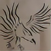
Oh, the first two are personal paintings, the following three are lines.
First: `Dianae
Second: =Michelle84
Third: :devpaulosbarrios:
Will be sending to scraps within a few days.
Oh, the first two are personal paintings, the following three are lines.
First: `Dianae
Second: =Michelle84
Third: :devpaulosbarrios:
Image size
2043x1648px 1.58 MB
© 2010 - 2024 HellionAngel
Comments40
Join the community to add your comment. Already a deviant? Log In
Well it's nice to see so many wips. Stay productive. <img src="e.deviantart.net/emoticons/s/s…" width="15" height="15" alt="
The first one, the colors are very nice and there is a good range of value and a clear light source. My only concern is the bottom of the dress. Unless she is going to be standing on some platform that her dress drapes over, the bottom part needs to lay flatter on the ground. Right now it looks like it is just floating. I know there isn't any defined space around her, but it goes a long way to still hint at it.
I like the movement and the pose in the second painting. The colors go nicely together. Things to remember are that when standing, usually when one shoulder is much higher than the other, the opposite hip will be higher than the other hip. So the right hip (her left) would need to be raised a bit more to make her pose make complete sense. There is also a lot more detail than needed in her stomach area. I don't know if you were going for a really tight shirt, but I would just flatten most of what you painted and stick with the shadow, the midtone, and the light just moving into each other with the contour of her stomach in mind.
WIP 3, everything looks good and the lighting is consistent on both character and environment. However saturated colors usually come forward in a composition and right now the bright purples of the sky are really competing against the character for the viewers attention. I would tone that down a bit and use something less bright. You could still use the same hue but just not in the same intensity.
WIP 4 is looking really good. The purple and brown is mixing nicely on her skin and I love the lighting in her hair. Just remember to add casts shadows from her body onto the flower or even her arms or legs casting shadows on her body.
The last one looks really smooth and there is some good shape to her. Perhaps you could up the contrast a little more to give it more volume but the colors choice and everything looks good.
I hope this helps. <img src="e.deviantart.net/emoticons/h/h…" width="15" height="13" alt="