Site Header

Deviation Actions


Promoted Deviations


Suggested Deviants


Suggested Collections





Featured in Groups




Description
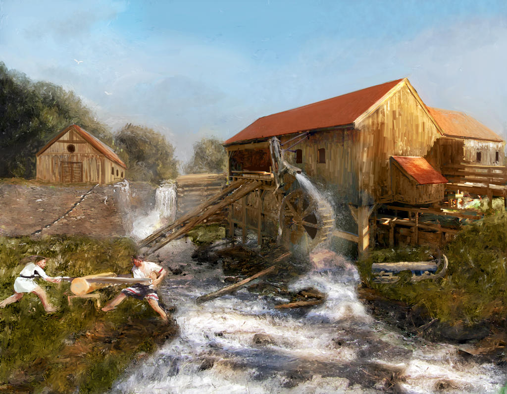
This is a try for a new project for a boardgame editor. The setting is ancient Rome's borderland life.
It's a loooong long time I don't use painter, but I returned to it to see if I can become faster in illustration for doing commercial works. This took me about 3 hours of work, still too much for the wage I get for those pieces (expecially if put against what I earn for graphic and web design), but I don't want to produce a piece I don't personally like so I put a little more time in it than planned.
Painter features really aided here in getting an "impressionist" feeling and mixing my matte and photoshop initial drawing.
The image (if the editors will think he likes the style and the money I asked for the work) will be featured on game cards, so it will be printed smaller than the original. I hope I will not loose too much of the initial image when I reduce it, else I will have to repaint it or make another anew (it's the first time I apply an architectural landscape to a little card).
Image size
1772x1375px 2.03 MB
© 2012 - 2026 Erebus-art
Comments2
Join the community to add your comment. Already a deviant? Log In

I had no idea Painter could give that sort of look -- very convincingly traditional painting, especially around the people/grass and water.
Says you want critique, so here's my reaction:
I love the bottom half of the image. Very organic, dynamic, full of energy. It's messy in that nice, impressionistic way. Lots of stuff going on, makes your eye want to look around and around (I find myself looping between the figures and the watermill area).
However, the top half is almost the opposite of these. Not much going on in the sky, or any lines to push the eye back to the main action (it's a big open space at the top, nothing inclosing/framing the main part of the image, so your eyes can just wander out). The rooftops seem very stiff and static, and also almost as if you haven't done the detailing for them yet. How about more texture, like you have in the bottom half of the image? The house in the background bugs me especially -- it sort of looks like you haven't finished painting it, and looks rather flat. Actually, if I put my fingers in front of that house and just imagine the trees there, the composition looks significantly better to me!