ShopDreamUp AI ArtDreamUp

Deviation Actions


Description
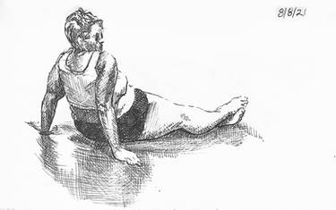
:origin()/pre00/a44c/th/pre/f/2018/056/f/c/2_by_1_of_millions-dc4b6rr.jpg) This is the reference I was using. Let me know what you think ^^
This is the reference I was using. Let me know what you think ^^looking at it now, I made the body a bit too wide. Unlike, the last one I did, I didn't spend as much time with proportions and measurements. The majority of the time was spent rendering and thinking of light and shadow. This one took me about an hour, thirty minutes shorter than my last one
I found it a bit hard to bring out my highlights, and tried constantly to differentiate my reflected lights from them. It was cool though, since I ended up utilized a kneaded eraser to try to get certain tones. Ended up being a lot harder than I thought in trying to get the right tone and the right amount of contrast. unfortunately I didn't have a stump, which would've but very useful, so i was only blending broad areas with my finger. couldn't quite get the little dark areas.
In terms of the pose, I keep finding that I don't make it dynamic enough. Next time I'll try to keep an eye out for my angles, for the angles on this one are far too subtle to be noticeable. It doesn't seem good that the photo is more dynamic than the drawing.....o.o
Image size
1458x1458px 398.35 KB
© 2018 - 2024 1-of-Millions
Comments25
Join the community to add your comment. Already a deviant? Log In
Hi, let me start with that this is a nice drawing so don't get me wrong on the critique details that follow here <img src="e.deviantart.net/emoticons/w/w…" width="15" height="15" alt="
1) Try to work on proportions first before committing to the shading. You have started from the head but when went down to the body everything has distorted. The reason is that you didn't double check the proportions. Try to see and use, let's say a head, or a width of shoulders, or something else to double-triple check the proportions of body parts in relation to each other. In this case you'd need to increase head right now by about almost a half of it to fit it to the body.
2) The angles make all the difference if the pose is dynamic or rigid. So draw a line (like a pilot line) really lightly to indicate the angle first between left and right shoulder; hips; center line of the body and how it curves....Basically if you just put the gesture first you'll see the movement of the pose, then you can add the details with correct proportions.
3) Don't let the body hang in thin air <img src="e.deviantart.net/emoticons/w/w…" width="15" height="15" alt="
4) Squint at your drawing and then squint at the photo reference. See the difference? This will tell you if you're putting the right darks and lights on the subject. In other words, you may need to put darker darks to show that things are in the shadow and the highlights within the shadow area then don't conflict with highlights in the lights area.
5) Cloths and skins have different tone values, so in the drawings they can't be of the same value. Again, that same squint test will confirm it for you. The easiest what you can do is convert that color photo into greyscale photo and you'll see just tones.
I hope these points make sense. Let me know if you want more clarification on them though, I'm happy to help!