ShopDreamUp AI ArtDreamUp
Deviation Actions


Suggested Deviants


Suggested Collections


You Might Like…


Featured in Groups


Description
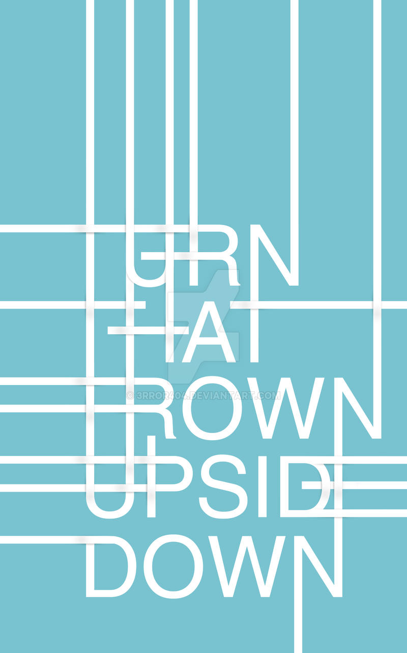
FULL VIEW else you'll miss it
--------------------------------
That's a smile not an upside down frown!
Hard to read I know, but this was only an experiment.
I initially thought that this was going to be an easy task. It really wasn't.
It may look simple but the .PSD for this image actually contains 58 layers!
----------------------
EDIT: Refined shading.
Image size
8598x13770px 9.48 MB
© 2009 - 2024 3rror404
Comments25
Join the community to add your comment. Already a deviant? Log In
I can see what you've tried to achieve. Using solid lines to link letters together and create an artistic word art piece. But somehow, I just don't think it's worked.
As it is at the moment, I think it's too busy. There are too many lines running around the piece that I don't know where to look! Especially in the top left area of the piece; and since there's so much going on, the text is difficult to read.
The bottom left is a lot nicer, and I love how you've created the E from the D and the lines. That's unique and well made. The N's being linked together is also a nice touch, along with the shading to make it appear that the lines are weaving in together.
Overall, I think if you just cleared up the top right side a little, ensured that it wasn't so busy and that just key points are linked together, then the piece could be a lot better.